Monday 25 August 2008

Mike Perry

An alphabet that was created for a performance at the Happy Ending event in New York
Feeling It Out, for an exhibition at Open Space
Dwell tree logo

Letter A from Alphabet Town

I quite like designer Mike Perry's typography designs.. especially the way he uses objects that relate to the concept to create the letters, for example the small trees that make the letters for the Dwell logo. Some of his typography work looks more like illustration than type but I think it really works. Mike Perry also does illustrations, art direction and web design but I think from his work the typography ones stand out. He has worked for example for Channel 4, MTV, Urban Outfitters and Nike.

Saturday 23 August 2008

Terminal Mirage - David Maisel


When I first saw photos from David Maisel's project Terminal Mirage I didn't know what the idea behind the project was and found it very interesting how some of the photographs are clearly landscapes and some so abstract it was hard to tell what was actually being photographed! Most of David Maisel's recent projects are aerial photographs of places that for example pollution has changed dramatically. These are from a project called Terminal Mirage where he took aerial photographs of The Great Salt Lake in Utah, USA. Some of the beautiful colours in the photos come from minerals or other naturally occurring elements and some from deadly toxins. These photos are visually very interesting and so beautiful but at the same time I find them disturbing..
David Maisel has done other projects definitely worth taking a look! One similar to this is one called The Lake Project.
Another project with an interesting contrast between the beauty of the colourful photos and what they are actually of is called Library of Dust. He took photos of copper canisters where the ashes of unclaimed patients of a psychiatric hospital were stored. The canisters were moved into a small room and stacked onto pine shelves. After some time the canisters begun to react chemically with the human ashes inside them and created a mold-like mineral outgrowths. How can it look so beautiful?!


Thursday 21 August 2008

Cardboard table


Liborius Reykjavik designed this portable cardboard table aiming to assist for example designers and students. I think it's a very witty idea. It's so simple but it seems quite handy and functional! The table is biodegradable and it can easily be folded up to pack into a portable carrier. I'm not so sure how a 400 dollar table is "student friendly" though...?!

Growing business card


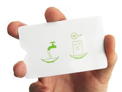
When you give someone your business card and really want them to remember you here's a very clever way by graphic designer and illustrator Jamie Wieck. He designed a business card that transforms from a regular business card to a miniature house plant. 'Another Bloomin' Designer' written on the front under the happy face and instructions on the back! Who would want to throw something so cute away?

WWF Eco Ad Campaign


This brilliant idea for a World Wildlife Fund ad campaign came from Saatchi&Saatchi Copenhagen, Denmark. A simple paper towel dispenser with a cut out the shape of South America through which you can see the stack of green paper towels. The towels illustrate the rainforests of the continent and every piece of paper you take is slowly draining out the greenness of South America! It's a very strong image and a great way to symbolise the environmental impact of disposable paper towels. Genius!

Wednesday 20 August 2008

Free Spirit Spheres


I came across a website advertising these free spirit spheres, or treehouses for adults.. and I have never seen anyting like this before! I would have booked mine already but the only place that has these amazing mini hotels is the west coast rainforest of Vancouver Island in Canada. There they hang like pendants from a web of rope in the middle of the tall trees. There are two different kind of spheres you can choose from, Eve or Eryn. If you ever need to get away or go somewhere to rest I think this might be the perfect place. It's such a unique idea and I love it that someone was brave enough to do this!

" Spheres can be hung from the trees as shown or from any other solid objects like buildings or rock faces. A web of rope is connected to any strong points available. This replaces the foundation of a conventional building. A suspended tree house uses the forest for its foundation. The occupants have a vested interest in the health of the grove. The supporting web also mirrors our connectedness to our surroundings. Each sphere has four attachments on top and another four anchor points on the bottom. Each attachment is strong enough to carry the entire sphere and contents."

Naïve Artists at Iittala

The Town of Cardamom by Katja Mesikämmen, 2006
Compassionate Pirates by Katja Mesikämmen, 2007
Cranky by Petra Heikkilä
Love Triangle, Mia Bergqvist, 2006

There is an exhibition of Finnish naive art in Iittala (a very small town in Finland) in an old wooden school building every summer that has become a must-see for me. Every summer, this year for the 20th time, they gather the best naive art (mostly paintings and sculpture) of about 30 different Finnish artists. The old building is a perfect space for this exhibition and the atmosphere there is lovely! 
My favourite pieces this year were by Katja Mesikämmen. You can't tell from the pictures here but all the people and animals in her paintings are glued on to the background separately which I think makes the paintings look more lively! I love the detail, the colours and the names of the paintings. A lot more of Katja Mesikämmen's paintings here!

Sunday 17 August 2008

Designed Memory


Designed Memory is a digital design studio based in New York specialising in interactive design for fashion and luxury brands. Designed Memory's work has such beautiful hand drawn texture, fluid motion and humour you just want to keep searching around! I love the way they've used collages for example for the website for fashion designer Chris Benz.. 

Some of my favourite websites designed by Designed Memory: Amalia, Rory Beca, Chris Benz and The Paper Moon Project

Kotama Bouabane - melting words


This is sort of mean, but very cool and interesting visually! I love this series of photos by Canadian photographer Kotama Bouabane called Melting Words. The letters of melting ice are very powerful when the messages are as devastating as 'I never loved you' and 'it's not u it's me'.

Saturday 16 August 2008

Kent Rogowski - Bears!


These very unusual teddybears are from an exhibition by Kent Rogowski called Bears. He has taken ordinary teddybears, turned them inside out and restuffed them! Each bear's appearance is determined by the manufacturing process - simple patterns and parts that were never meant to be seen have become the bear's physical characteristics. They all have a new quirky personality and it's hard to decide if they are still adorable and cuddly or just strange and hideous. 

Friday 15 August 2008

Branislav Kropilak

Factories no. 07 (2008)
Garages no.18 (2005)
Landings no.09 (2006)
Billboards no.05 (2008)

Branislav Kropilak is a contemporary photographer born in Slovakia. He studied at the Private Academy of Fine Arts in Bratislava and afterwards at the Institute of Digital Photography in Prague. He has worked for example for BBDO, McCann Erickson and Saatchi & Saatchi. 
The main theme in his work is investigating the way modern technology has changed the environment and our lives. He is inspired by industrial design, architecture and urbanism. I think it's interesting how most of his photographs are of things that are not considered beautiful, for example garages and factories, and how he can make you look at them in a different way. 

Monday 11 August 2008

Invisible Streetlights


What if instead of standard streetlights parks and other public places were brightened by solar-powered 'leaf' streetlights? That's the idea behind Jongoh Lee's elegant invisible streetlight. The lamps are designed to wind around existing branches and store the sun's energy throughout the day. “The most innovative element of Invisible Streetlight is that it does not require a support because the flexible body in the shape of tree branch is directly installed to the trees lining a street.”
The invisible streetlight was recently awarded with an IDEA (International Design Excellence Awards) award.

funky forest


This amazing digital forest called Funky Forest was created by visual and motion graphics designer Emily Gobeille and interactive artist and designer Theodore Watson. They created it for the Cinekid Festival in Amsterdam. The installation is a simulated experience where visitors influence the environment around them. For example, by diverting streams of water flowing on the floor different parts of the forest grow. If a tree doesn't get enough water it dies but standing against a wall and pressing your body into the forest creates new trees based on your shape. This installation is simply amazing, beautifully illustrated and colourful. 
I would love to have actually been there. 
You can watch a video of it here!

Sunday 10 August 2008

big head coasters


J-me is a company that specialises in the design of contemporary gifts and accessories for the home. It was founded by two brothers, Mark and Jamie. These big head coasters are a good example of their fun and witty style! When not in use you can stand them back up to wait for your next cup of tea, serves them right for having such a huge head!

Friday 8 August 2008

Linn Olofsdotter

'Perfume Flowers'
'Hotel Wonder Exhibition'

I saw some amazing illustrations by a Swedish illustrator Linn Olofsdotter in a few months old Plaza magazine. The first one here is an illustration she did for an article about fantasy flowers used in perfumes and the second one is for an internationnal furniture show in Milan where 44 illustrators were invited to illustrate a part of "the perfect hotel". This is her illustration for the perfect toilet. 
After getting a degree in advertising and graphic design in Europe she moved to Brazil and started a motion graphics studio with her husband. She has also worked as an art director at an advertising agency in Boston and is now working independently creating artwork for clients such as Levi's, Oilily, La Perla and Bon Magazine. 

'Dark Seductive Fruits' - a cover illustration she did for Inspire magazine

Wednesday 6 August 2008

The Melancholy Death of Oyster Boy


The Girl Who Turned into a Bed

It happened that day
she picked up a strange pussy willow.
Her head swelled up white
and a soft as a pillow.

Her skin, which had turned
all flaky and rotten,
was now replaced
with 100% cotton.

Through her organs and torso
she sprouted like wings,
a beautiful set
of matress and springs.

It was so terribly strange
that I started to weep.
But at least after that
I had a nice place to sleep


The Melancholy Death of Oyster Boy & Other Stories is an illustrated book of poetry by Tim Burton I recently read. He has created a variety of new freakish characters such as Stain Boy, Anchor Baby and The Pin Cushion Queen. Most of the 23 tales in the book are quite tragic or even sad but Tim Burton's humour makes it ok. All illustrations in the book are also by Tim Burton. You can read some of the poems here!

Rocking wheel chair


I'm not sure how comfortable this wheel chair would be to sit on-  but the design looks great and so stylish! It was designed by Mathias Koehler. There is a light in the upper part of the chair and maybe the coolest thing is that the power source is charged by the rocking motion itself located in the back of the chair. I think this chair needs armrests to be more comfortable but then it might not look as good..

Sunday 3 August 2008

Alberto Seveso


Beautiful typography by Alberto Seveso! Some of them are a little bit hard to read, or maybe they're not meant to be read anyway. The colourful watercolour background is very nice with the typeface. It looks like a lot of layers painted on top of each other. For some reason the pictures look a bit different here so check out his portfolio here!